The hourly heatmap
P&L, win rate or trade count by hour × weekday — find when you are actually profitable.
Calendar → Hourly heatmap crosses your trades by day of the week and hour, and colors each cell by the metric you choose. Two selectors drive it:
- Metric — average P&L, win rate, or trade count.
- Timezone — display the grid in your local time (the list covers UTC−12 to UTC+12 with reference cities).
Reading it
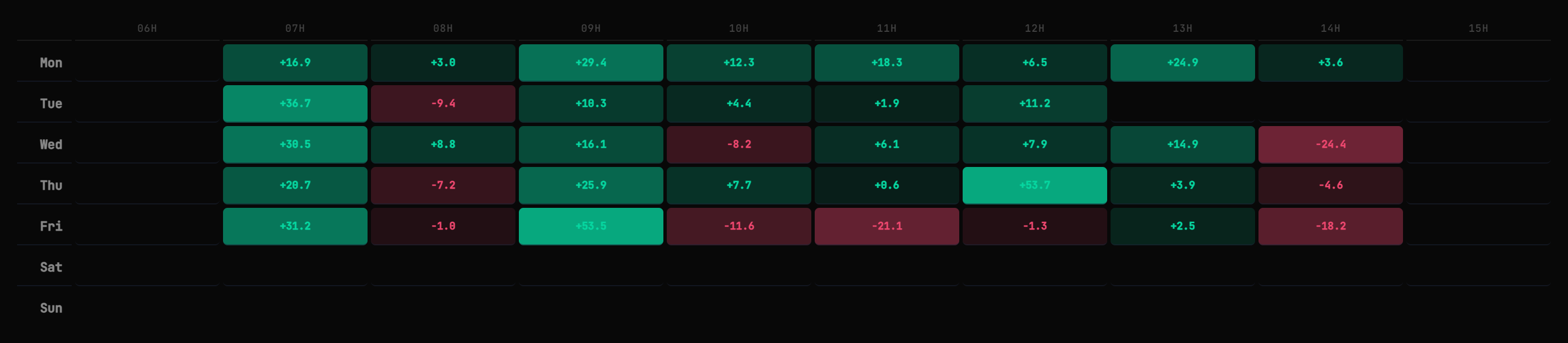
Day × hour grid — the intensity of each cell is the size of the average result.
Green cells = profitable hours; red = costly ones; intensity = magnitude. Hover a cell for the exact figure and the number of trades behind it. Under the grid, two cards rank your best hours and worst hours.
Daylight-saving time shifts sessions by an hour twice a year — a “bad 16:00” in winter may be your “bad 15:00” in summer. Keep that in mind when reading year-long data.
Few trades in a cell = weak signal. Trust patterns backed by dozens of trades, not three.
Still stuck? Contact support — or send feedback from the app: profile menu → Settings → Feedback.